Tuesday, April 23
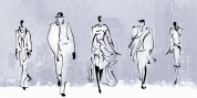
A Curated Gallery of Smashing Fonts for Creative Designers
38,691 Premium Fonts
Tuesday, April 23
A Curated Gallery of Smashing Fonts for Creative Designers
38,691 Premium Fonts


 Designers: Alf Becker, Michael Adkins
Beginning in January, 1932, Alf R. Becker of St. Louis Missouri, at the request of then-editor E. Thomas Kelly, supplied SIGNS of the Times magazine's new Art and Design section with an alphabet a month, a project initially predicted to last only two years. Misjudging the popularity of the 'series,' it instead ran for 27 years, ending finally two months before Becker's death in 1959, for a grand total of 320 alphabets, a nearly perfect, uninterrupted run. In late 1941, just ten years after the first alphabet was published, 100 of them were compiled and published in book form under the title, '100 Alphabets,' by Alf R. Becker.
As published in July 1937, this is the description that accompanied Becker's 67th alphabet, Modern Roman thick-and-Thin:
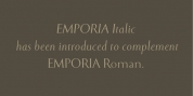
Modern Roman Thick-and-thin, Alf R. Becker's sixty-seventh alphabet in his SIGNS of the Times series, is an attractive, easy-to-read headline letterform, similar in some respects to Spurred Egyptian Thick-and-Thin.
Many font designers have tackled converting Becker's incredible achievement from paper to digital, and many claim to treat his work with care and dignity. But the Fontry's Becker fonts remain the most historically accurate and viable treatments available, arriving in two industry-satisfying versions: CAS (Computer-Aided Signmaking) and DTP (Desktop Publishing). And as with all Fontry fonts, the kerning is not optional--it's exceptional-!!!
Font Family:
· ARB 67 Modern Roman JUL-37 DTP Normal
· ARB 67 Modern Roman JUL-37 DTP Normal Italic
· ARB 67 Modern Roman JUL-37 DTP Bold
· ARB 67 Modern Roman JUL-37 DTP Bold Italic
· ARB 67 Roman Tall JUL-37 DTP Normal
· ARB 67 Roman Tall JUL-37 DTP Normal Italic
· ARB 67 Roman Tall JUL-37 DTP Bold
· ARB 67 Roman Tall JUL-37 DTP Bold Italic
· ARB 67 Modern Roman JUL-37 CAS Normal
· ARB 67 Modern Roman JUL-37 CAS Normal Italic
· ARB 67 Modern Roman JUL-37 CAS Bold
· ARB 67 Modern Roman JUL-37 CAS Bold Italic
· ARB 67 Roman Tall JUL-37 CAS Normal
· ARB 67 Roman Tall JUL-37 CAS Normal Italic
· ARB 67 Roman Tall JUL-37 CAS Bold
· ARB 67 Roman Tall JUL-37 CAS Bold Italic
Tags: 1930s, roman, spur serif, thick & thin, wedge-serif