Wednesday, May 8
A Curated Gallery of Smashing Fonts for Creative Designers
38,691 Premium Fonts
Wednesday, May 8
A Curated Gallery of Smashing Fonts for Creative Designers
38,691 Premium Fonts


 Designer: Isabella Chaeva
It is a good sans serif choice for listings, catalogues and directories as its design is very space saving. The weight of the line is moderate and uniform. Being a clear and easy-to-read font, Bell Gothic is popular now for display and magazine advertising.
Cyrillic version by Isabella Chaeva was released by ParaType in 1999. Italic styles added in 2009 by the same designer.
Font Family:
· Bell Gothic
· Bell Gothic Italic
· Bell Gothic Bold
· Bell Gothic Bold Italic
· Bell Gothic Black
· Bell Gothic Black Italic
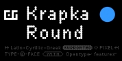
Tags: band, bell, bold, book, books, branding, classic, corporate, corporative, cyrillic, display, formal, grotesk, grotesque, handbook, headline, hinted, legible, light, low-res, magazine, manual, multilingual, narrow, neo-grotesque, neutral, open, retro, russian, sans, sans-serif, sans serif, static, tech, technical, techno, technology, tech pubs, text, true italics, turkish, vintage, workhorse