Sunday, April 28
A Curated Gallery of Smashing Fonts for Creative Designers
38,691 Premium Fonts
Sunday, April 28
A Curated Gallery of Smashing Fonts for Creative Designers
38,691 Premium Fonts


 Designer: Gareth Hague
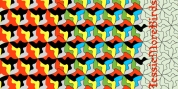
For Capo we wanted to mix the expressive quality of its 'pinch' idea with an overall aesthetic that could be applied to text rather than headline. So Capo has something of the function and warm, organic quality of Grotesque style typefaces.
In Capo's Bold and Black weights the sharpness of the letter shapes is more dramatic and emphasised, making for great effect for large-sized text.
Why Capo? A capo is a device used on the neck of a stringed (typically fretted) instrument to shorten the playable length of the strings by pinching or clamping them in place, hence raising the pitch.
Font Family:
· Capo Light
· Capo Medium
· Capo Bold
· Capo Black
Tags: grot, grotesque, incised, sans serif