Saturday, April 20
A Curated Gallery of Smashing Fonts for Creative Designers
38,691 Premium Fonts
Saturday, April 20
A Curated Gallery of Smashing Fonts for Creative Designers
38,691 Premium Fonts


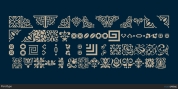
 Designer: Ingo
Zimmerman
Designer: Ingo
ZimmermanIn Charpentier Renaissance, the strokes of the wide pen are still noticeable. The font has very defined softly bent serifs. The forms are powerful and stand solidly on the baseline. Charpentier Renaissance is very legible and yields a solid and yet still lively line formation.
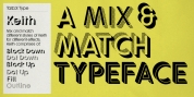
The accompanying cursive, like its historical models, has almost no inclination. The lower case characters of Charpentier Renaissance Italique have such idiosyncratic figures that they can also form a font of their own.