Saturday, April 27
A Curated Gallery of Smashing Fonts for Creative Designers
38,691 Premium Fonts
Saturday, April 27
A Curated Gallery of Smashing Fonts for Creative Designers
38,691 Premium Fonts


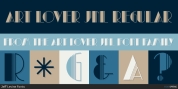
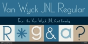
 Designer: Eduilson Coan
However, all these features are designed with distinct shapes and details. Notice the angled terminals – the cut at the end of the strokes – or how the vertical strokes in the italics seem to 'bend' a little, for instance.
The sum of these and many more design decisions result in a typeface capable of delivering a strong presence to sites, interfaces, apps, magazines and corporate graphic language.
Font Family:
· dT Ampla Light
· dT Ampla Light Italic
· dT Ampla Book
· dT Ampla Book Italic
· dT Ampla Regular
· dT Ampla Regular Italic
· dT Ampla Semi Bold
· dT Ampla Semi Bold Italic
· dT Ampla Bold
· dT Ampla Bold Italic
Tags: advertising, branding, clean, commercial, contemporary, corporate, digital, display, flexible, friendly, headline, humanist, interface, legible, logotype, modern, personality, print, sans, sans-serif, sans serif, ui, unique, versatile, workhorse