Friday, April 19
A Curated Gallery of Smashing Fonts for Creative Designers
38,691 Premium Fonts
Friday, April 19
A Curated Gallery of Smashing Fonts for Creative Designers
38,691 Premium Fonts


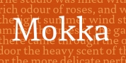
 Designer: Dave Rowland
Engria started life way back in 2014, and has been worked and reworked tirelessly to get to this finished product. My intent was to really push the idea of the white shapes being as important, if not more so, than the black.
Engria is equipped for typographically demanding applications, boasting as it does an array of OpenType features, including small caps, automatic fractions, stylistic sets, various figure styles, arrows, case sensitive forms and more. It will make a very useful addition to your typographic arsenal, with a flare (ahem) for editorial work, but the individuality for packaging, branding, and logo work.
Font Family:
· Engria Regular
· Engria Regular Italic
· Engria Medium
· Engria Medium Italic
· Engria Bold
· Engria Bold Italic
· Engria Black
· Engria Black Italic
Tags: albertus, alternates, book, branding, capital sharp s, carved, chiselled, chunky, coherent, contemporary, corporate identity, curved diagonals, cut-out, cuts, editorial, engraved, flared, flared stems, friendly, friz quadrata, glyphic, indian rupee, jagged, latin serifs, legible, low contrast, magazine, oldstyle figures, optima, readable, robust, rugged, russian ruble, sculptural, semi serif, serif, serious, small cap figures, small capitals, small caps, sophisticated, splayed, stressed, sturdy, text, triangular serifs, true italics, turkish lira, typographic, unique, versatile, wedge serif, workhorse