Thursday, May 2
A Curated Gallery of Smashing Fonts for Creative Designers
38,691 Premium Fonts
Thursday, May 2
A Curated Gallery of Smashing Fonts for Creative Designers
38,691 Premium Fonts


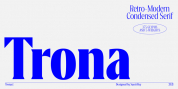
 Designer: Carlos Camargo Guerrero
In that vein, Floro refers to improvised design, deletion and copying. For that reason, its determinants seem stencil patterns that attract the attention of the reader. Its inaccurate decisions were planned that way, in which the type of contrast seems made with a flat tip and the amount of contrast between thick and thin is medium. Its sizes, regular and italic shine by their systematic wear and terminations sometimes in pointed forms resembling medieval darkness.
In short, we can say that Floro comes from the miscegenation of Gothic calligraphy texture, foundational calligraphy and some refinements of gothic writings with italic sans-serif ideas of late 19th century. Even with the blur appearance, floro has ideal proportions to pile for horizontal and vertical areas when composing titles with striking looks and robust. And finally, floro dingbats are related shields and stamps, to accompany the written resulting useful at the level of visual support and hierarchical.
Font Family:
· Floro
· Floro Italic
· Floro Dingbats
Tags: 1900s, all caps, american, antique, brush, grotesque, grunge, industrial, ink, letterpress, messy, old, retro, rough, rugged, sans serif, stamp, texture, vintage, weathered, wood, wood type, worn