Thursday, May 2
A Curated Gallery of Smashing Fonts for Creative Designers
38,691 Premium Fonts


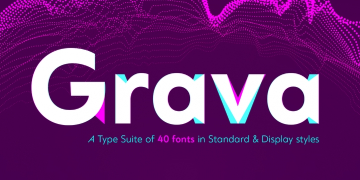
 Grava was designed by Neil Summerour and published by Positype. Grava contains 40 styles and family package options.
 The Grava font family comes in two styles (a normal and a Display), each with 20 weights (Thin to Ultra) and paired with italics. Its design allowed the three scripts of Latin, Cyrillic, and Greek to emerge seamlessly, ensuring Grava will find its home in multilingual publications. Even better, each character in the three scripts is spaced with every other character for a beautifully matched fit, and it's a buy-one-get-all-three deal since they are all packaged together. The normal style's large x-height won't let you down in paragraphs, headings, and any call-out text. And have you seen the angles on those numerals? Pairing Grava's numerals on a jersey is sure to catch some eyes, just sayin'.
Grava Display is purposefully quirky and sharp, and made for poster sizes, book and album covers, and those websites with a well-defined character - somewhere between playfully self-aware and overtly vintage. Flat edges are abandoned to make way for sharp points and conspicuousness, for geometrical attitude and respectful expressiveness. Corporate reports use Grava Display to take on a professional and current look. The optional ligatures (N–T, L–L, G–A, C–O, almost anywhere an 'A' is placed, and more) in both the normal and Display styles invoke a midcentury modernist and high art feel. Now that introductions are done, you can let go of Grava's hand and put it to work for you.
Font Family:
· Grava Thin
· Grava Thin Oblique
· Grava Extra Light
· Grava Extra Light Oblique
· Grava Light
· Grava Light Oblique
· Grava Normal
· Grava Normal Oblique
· Grava Roman
· Grava Oblique
· Grava Medium
· Grava Medium Oblique
· Grava Semi Bold
· Grava Semi Bold Oblique
· Grava Bold
· Grava Bold Oblique
· Grava Black
· Grava Black Oblique
· Grava Ultra
· Grava Ultra Oblique
· Grava Display Thin
· Grava Display Thin Oblique
· Grava Display Extra Light
· Grava Display Extra Light Oblique
· Grava Display Light
· Grava Display Light Oblique
· Grava Display Normal
· Grava Display Normal Oblique
· Grava Display Roman
· Grava Display Oblique
· Grava Display Medium
· Grava Display Medium Oblique
· Grava Display Semi Bold
· Grava Display Semi Bold Oblique
· Grava Display Bold
· Grava Display Bold Oblique
· Grava Display Black
· Grava Display Black Oblique
· Grava Display Ultra
· Grava Display Ultra Oblique
Tags: advertising, american, avant garde, black, bold, branding, century gothic, circle, circle o, classic, clean, commercial, creative, crisp, cyrillic, display, elegant, free, free fonts, futura, geometric, geometric sans, greek, grotesk, grotesque, headline, high x-height, legible, logo, logotype, magazine, packaging, poster, print, sharp, stylish, warm
