Tuesday, April 23
A Curated Gallery of Smashing Fonts for Creative Designers
38,691 Premium Fonts
Tuesday, April 23
A Curated Gallery of Smashing Fonts for Creative Designers
38,691 Premium Fonts


 Designer: Jeremy Dooley
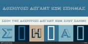
Grenale's thin weights are simple but vibrant--elegant forms that naturally lend themselves to designer journals and high-end branding along with upscale applications. With added energy and power, the thicker weights give your work a firmer, statlier look. Grenale #2's upright versions are also matched by optically adjusted italics. While unique in appearance, any of #2's weight also provide a well-matched companion to its original counterpart.
The fashionable typeface includes a multitude of alternates that may be accessed in any OpenType-enabled application. The stylish features include a large group of alternates, swashes, and meticulously refined details with ball terminals and alternate titling caps to accessorize the font. Also included are capital swash alternates, old style figures, and small caps. Peruse the PDF brochure to see these features in action. OpenType enabled applications such as the Adobe suite or Quark can take full advantage of the automatic replacing ligatures and alternates. This family also offers the glyphs to support a wide range of languages.
It's time to think high-class. Graceful and assured, the carefully crafted forms of Grenale #2 step pleasantly onto each page with elegant charm. Include its range of alternate glyphs, and this chic font is a superb choice for bringing a far more refined look to your projects.
Font Family:
· Grenale #2 Con Thin
· Grenale #2 Con Thin Italic
· Grenale #2 Con Light
· Grenale #2 Con Light Italic
· Grenale #2 Con Book
· Grenale #2 Con Book Italic
· Grenale #2 Con Regular
· Grenale #2 Con Italic
· Grenale #2 Con Medium
· Grenale #2 Con Medium Italic
· Grenale #2 Con Demi
· Grenale #2 Con Demi Italic
· Grenale #2 Con Bold
· Grenale #2 Con Bold Italic
· Grenale #2 Con Black
· Grenale #2 Con Black Italic
· Grenale #2 Nor Thin
· Grenale #2 Nor Thin Italic
· Grenale #2 Nor Light
· Grenale #2 Nor Light Italic
· Grenale #2 Nor Book
· Grenale #2 Nor Book Italic
· Grenale #2 Nor Regular
· Grenale #2 Nor Italic
· Grenale #2 Nor Medium
· Grenale #2 Nor Medium Italic
· Grenale #2 Nor Demi
· Grenale #2 Nor Demi Italic
· Grenale #2 Nor Bold
· Grenale #2 Nor Bold Italic
· Grenale #2 Nor Black
· Grenale #2 Nor Black Italic
· Grenale #2 Ext Thin
· Grenale #2 Ext Thin Italic
· Grenale #2 Ext Light
· Grenale #2 Ext Light Italic
· Grenale #2 Ext Book
· Grenale #2 Ext Book Italic
· Grenale #2 Ext Regular
· Grenale #2 Ext Italic
· Grenale #2 Ext Medium
· Grenale #2 Ext Medium Italic
· Grenale #2 Ext Demi
· Grenale #2 Ext Demi Italic
· Grenale #2 Ext Bold
· Grenale #2 Ext Bold Italic
· Grenale #2 Ext Black
· Grenale #2 Ext Black Italic
Tags: alternates, beautiful, classic, delicate, display, elegant, fancy, fashion, feminine, flourish, headline, invitation, ligatures, low-contrast, magazine, ornament, sans, sans-serif, stationary, superfamily, swash, swashes, thin, wedding