Friday, April 19
A Curated Gallery of Smashing Fonts for Creative Designers
38,691 Premium Fonts


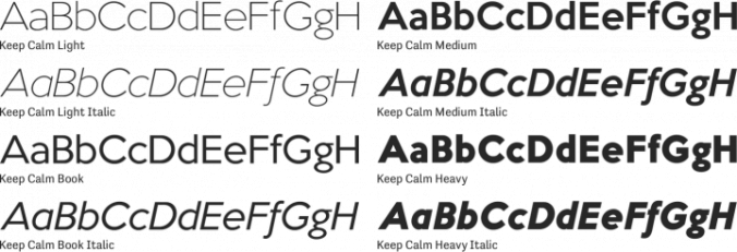
 Keep Calm is a sans serif font family. This typeface has eight styles and was published by K-Type.
Keep Calm is a family of fonts developed from the now famous World War 2 poster that was designed in 1939 but never issued, then rediscovered in 2000. As well as the original Keep Calm font, the Medium weight of the poster, three new weights are available - Book (regular), Heavy and Light. Version 2.0 (2017) is a comprehensive update which consists of numerous refinements and improvements across all weights. The family now contains a full complement of Latin Extended-A characters, Welsh diacritics, and Irish dotted consonants. The four italics have been optically corrected with revised, ‘true italic’ forms of a and f.
The crown motif from the top of the Keep Calm poster is located at the plus minus ± and section § keystrokes (Alt 0177 and Alt 0167 on Windows). The lowercase g follows the Gill/Johnston eyeglass model, but also included is an alternative, single-story g at the Alt G keystroke (Alt 0169 on a Windows keyboard), the normal location of the copyright symbol which has been relocated elsewhere in the fonts. An alternative lowercase t, without the curved wedge cutaway, is provided at the Alt T (dagger) keystroke (Alt 0134 on Windows).
When I first saw the Keep Calm and Carry On poster, I wrongly assumed the letters to be Gill Sans. Although that influence is apparent, in the R particularly, the lettering was clearly hand-drawn by a talented designer who, if the M’s perfectly pointed vertex is anything to go by, was equally steeped in the signage of the London Underground. The most anomalous character, the C, resembles that found in the Gotham typeface, and given that Gotham’s vernacular sources included the handmade, ‘basic lettering’ of engineers, perhaps that shouldn’t be surprising.
Developing the Keep Calm typeface has been an exercise in extrapolation; an intriguing challenge to build a whole, high quality font family based on the twelve available uppercase letters of the Keep Calm poster, and on similar lettering from the other two posters in the original series. This has required the creation of complementary lowercases that are believably 1939; that maintain the influence of Gill and Johnston while also hinting at the functional imperative of a wartime drawing office. The draughtsman was balancing intuitive, human qualities and the pure pleasure of drawing elegant contemporary letters, against an underlying geometry of ruled lines, perfect circles, 45° terminals, and a requirement for no-nonsense clarity.
Font Family:
