Wednesday, April 24
A Curated Gallery of Smashing Fonts for Creative Designers
38,691 Premium Fonts
Wednesday, April 24
A Curated Gallery of Smashing Fonts for Creative Designers
38,691 Premium Fonts


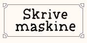
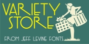
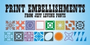
 Publisher: Jeff Levine Fonts
It seems that after the 1960s, very few display typefaces were being produced that had the desirability to transcend generations, as did many type designs of the past.
In 1970, a local television station embraced a lettering style for its logo that was a cross between round point pen nib lettering and the modular, techno look complete with squared characters in a futuristic “space age” style.
News Crew JNL was inspired by the few examples found of this particular font [in use by the station at the time] and was pretty much created from scratch in order to capture the 1970s era of experimental typography. It is available in both regular and oblique versions.
Font Family: