Thursday, May 9
A Curated Gallery of Smashing Fonts for Creative Designers
38,691 Premium Fonts
Thursday, May 9
A Curated Gallery of Smashing Fonts for Creative Designers
38,691 Premium Fonts


 Designer: Jeff Levine
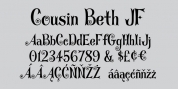
The alphabet is in a distinctly bold, asymmetrical style, while the numbers almost take on a calligraphic feel.
There is just a basic character set - alphabet, numerals and simple punctuation. While the font has been reasonably spaced and kerned, it's best to remember that neither type design was made with digital technology in mind, so it's suggested to adjust your layout manually for optimum results.
Nobody Home JNL is best-suited for replicating street addresses, apartment numbers on doors, and homeowner (or apartment house) names on buildings - whether in print design or as plotter-cut vinyl graphics.
Font Family: Nobody Home JNL
Tags: address, casual, house letters, novelty, retro, sign, signage, unusual