«Back ·
Southwark Font Download


 Designer:
 David Kerkhoff
Publisher: Hanoded
was designed by David Kerkhoff and published by Hanoded.
Southwark contains 2 styles and family package options.
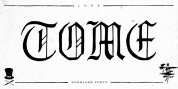
London is one of my favourite cities, so it was about time I named a font after it. Well, technically, I named a font after one of London's districts.
Southwark comes from the Anglo-Saxon word Suthriganaweorc, which means 'Fort of the men of Surrey'. The font Southwork is a handmade Clarendon. I used a Japanese brush pen to create the outlines. I gave the glyphs texture by filling them in with a brush and Chinese ink.
Southwark, therefore, has an uneven look and a brushy texture. It looks good on just about anything, but posters, greeting cards and product packaging come to mind.
Font Family:·
Southwark Regular·
Southwark ItalicTags: all caps, baskerville, bold, book cover, brush, brushed, brush texture, caps, caslon, clarendon, clear, display, eroded, fat, film poster, hand drawn, hand made, handmade, ink, legible, loud, messy, movie poster, multilingual, obese, old style, packaging, product packaging, rough, scribble, scribbled, serif, title, titling, transitional, unique