Tuesday, April 23
A Curated Gallery of Smashing Fonts for Creative Designers
38,691 Premium Fonts
Tuesday, April 23
A Curated Gallery of Smashing Fonts for Creative Designers
38,691 Premium Fonts


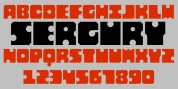
 Publisher: Dharma Type
Why do designers make more and more geometric fonts? There are already many geometric sans in the world.
Because It is a natural flow of design. It is true that we like geometric type instinctively.
Taro was designed to archive a good balance between the following three things geometrically:
1. To be Natural, Flowing, Organic.
2. To be Neutral, Unbiased, Universal.
3. To be legible, distinguishable, readable.
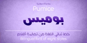
Consists of eight weights and their matching italics. Supporting almost all latin languages.
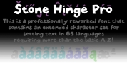
All-caps text for one line or a few is as wonderful as normal mixed-case typesetting.