Monday, April 29
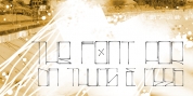
A Curated Gallery of Smashing Fonts for Creative Designers
38,691 Premium Fonts
Monday, April 29
A Curated Gallery of Smashing Fonts for Creative Designers
38,691 Premium Fonts


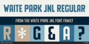
 Designers: Morris Benton, Tomi Haaparanta
Tee Franklin has seven weights with obliques, the Heavy being just slightly heavier than the existing versions from Adobe and ITC, and moving down to totally new Ultra Light, using Luc(as) de Groot's formula to keep the weights optically correct.
The glyphs are the same as the Morris Fuller Benton's original from 1902, except for the upper case Q, which was re-designed with a loop in the counter for added differentiation.
Font Family:
· Tee Franklin UltraLight
· Tee Franklin UltraLight Oblique
· Tee Franklin Thin
· Tee Franklin Thin Oblique
· Tee Franklin Light
· Tee Franklin Light Oblique
· Tee Franklin Book
· Tee Franklin Book Oblique
· Tee Franklin Medium
· Tee Franklin Medium Oblique
· Tee Franklin Bold
· Tee Franklin Bold Oblique
· Tee Franklin Heavy
· Tee Franklin Heavy Oblique
Tags: clean, editorial, fashion, gothic, headline, large x-height, magazine, modern, morris fuller benton, sans-serif, text, thin, very light