Thursday, May 2
A Curated Gallery of Smashing Fonts for Creative Designers
38,691 Premium Fonts
Thursday, May 2
A Curated Gallery of Smashing Fonts for Creative Designers
38,691 Premium Fonts


 Publisher: HiH
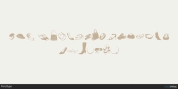
Roos & Junge of Offenbach am Main in Germany produced Teutonia in a 'back-to-basics' effort that has seen many quite similar attempts in the field of topography. In 1883, Baltimore Type Foundry released its Geometric series. In 1910, Geza Farago in Budapest used a similar letter design on a Tungsram light bulb poster. In 1919 Theo van Doesburg, a founder with Mondrian and others of the De Stijl movement, designed an alphabet using rectangles only -- no diagonals. In 1923 Joost Schmidt at Bauhaus in Weimer took the same approach for a Constructivist exhibit poster. The 1996 Agfatype Collection catalog lists a Geometric in light, bold and italic that is very close to the old Baltimore version. Even though none of these designs took the world by storm, they all made a contribution to our understanding of letterforms and how we use them.
Teutonia is compact and surprisingly readable at 12 points in print, but does not do as well on the screen. Extra leading is suggested. Four ligatures are supplied: ch, ck, sch and tz. The numerals are tabular.
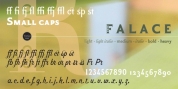
Font Family: Teutonia
Tags: 1900s, art, art nouveau, blackletter, computer, constructivist, decorative, de stijl, geometric, german, masculine, propaganda, revival, russian, sans-serif, square