Friday, April 26
A Curated Gallery of Smashing Fonts for Creative Designers
38,691 Premium Fonts
Friday, April 26
A Curated Gallery of Smashing Fonts for Creative Designers
38,691 Premium Fonts


 Designer: Dennis
Ludlow
Designer: Dennis
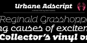
LudlowThis urban, yet elegant display font has been revamped with redesigned lowercase companions to compliment the existing set. Artistic alternates were added for several characters along with 2 stylistic sets. As is the case with display fonts, this one is not meant to be used in body text but to serve as an ornamental solution for logos, titles, and more.
More emphasis was put on bringing out the wonderful French curves in Vonique over and over. Upper and lowercase letters were not designed to coexist, however certain combinations will produce striking results.
Font Family: