Saturday, April 20
A Curated Gallery of Smashing Fonts for Creative Designers
38,691 Premium Fonts
Saturday, April 20
A Curated Gallery of Smashing Fonts for Creative Designers
38,691 Premium Fonts


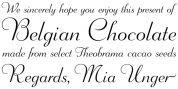
 Publisher: GLC Foundry
This family was created inspired from the eroded and tired fonts used by printers from the sixteen century to the early years of twentieth for cheap or fleeting works, like almanacs, adverts, gazettes or popular novels. This patern is partialy isued from a dirty Garamond used for print a small school booklet for children, in Dijon (France)circa 1689. There is two styles: Normal and Italic, with small caps and lower cases alternates added and a few fleurons from the same printers. It’s original cap’s hight is about seven millimeters. Decorated letters like “1512 Initials”,“1550 Arabesques”, “1565 Venetian” “1584 Rinceau” or others in progress from GLC Foundry, can be used with this family without anachronism.
We have added to the family a set of symbols frequently in use in the Almanacs and calendars in the same time.