Wednesday, April 24
A Curated Gallery of Smashing Fonts for Creative Designers
38,691 Premium Fonts
Wednesday, April 24
A Curated Gallery of Smashing Fonts for Creative Designers
38,691 Premium Fonts


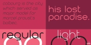
 Designer: Neil Summerour
Whereas Aaux and its siblings are rather unforgiving and stark in their presentation, I wanted this new sans serif to 'smile' at you when it's on the page. When the plane landed and I realized I did not sleep through the 15 hour trip, my brain shut off, the laptop closed and I hopped in the car to the hotel-forgetting the 'new sans' folder on my desktop.
Fast forward a few months and I found myself seeing a lot of crisp, rigid, robot-like sans serif typefaces everywhere... I enjoy these new crop of faces but wanted to see something 'friendlier' and remembered my earlier sketch work. The groundwork was there screaming at me to complete and Akagi arose from the ashes.
To be truly satisfied with it personally, a great deal of time was spent trying to create a harmony between line and curve in an attempt to show that you can be crisp, clean and legible and still keep some personality. The Light and Fat weights (regular and italic) are my favorites and I hope to see them as the workhorses of the typeface.
Font Family:
· Akagi Thin
· Akagi Thin Italic
· Akagi Light
· Akagi Light Italic
· Akagi Book
· Akagi Book Italic
· Akagi Medium
· Akagi Medium Italic
· Akagi SemiBold
· Akagi SemiBold Italic
· Akagi Bold
· Akagi Bold Italic
· Akagi ExtraBold
· Akagi ExtraBold Italic
· Akagi Black
· Akagi Black Italic
· Akagi Ultra
· Akagi Ultra Italic
· Akagi Fat
· Akagi Fat Italic
Tags: clean, headline, humanist, magazine, news, news text, opentype, optical, sans-serif, text, true italics, workhorse