Saturday, April 20
A Curated Gallery of Smashing Fonts for Creative Designers
38,691 Premium Fonts


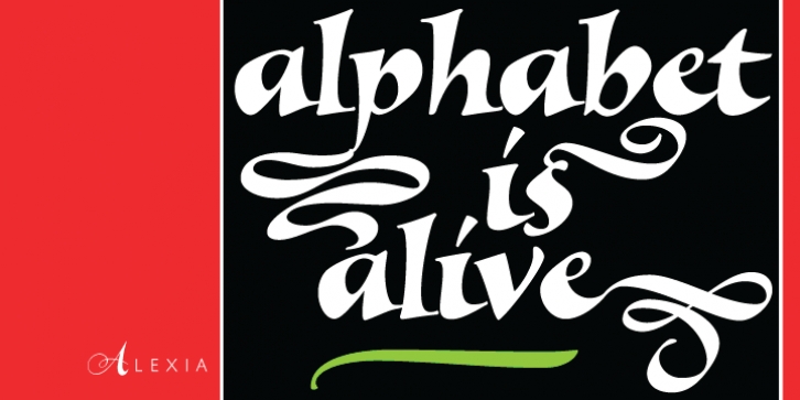
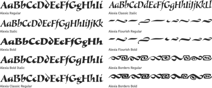
 Alexia is a dingbat and historical font family. This typeface has ten styles and was published by Canada Type.
Philip Bouwsma is concerned about the survival of calligraphy in the computer age. The last time there was a technology shift of this magnitude, in Gutenberg’s day, the metal workers shouldered out the scribes and set their own stamp on type design, relegating calligraphy to a niche role where it still languishes. Now we are faced with another crisis, surely our last chance to integrate the classical broad pen technique into mainstream typography; but this time we have the tools to convey the subtlety of the finest calligraphy. The machine doesn’t simply make a snapshot or a still-life of the calligrapher’s expression; it has now become the tool that can inspire and help the designer with the task on hand.
Bouwsma has spent the last few years developing a theory of digitizing formal historic and contemporary calligraphic styles, blending them into a seamless web like the hands themselves. His overall plan is to recreate historic calligraphy as it would have evolved if it had not been impeded by technnological limitations, wars, persecutions and human frailty. With a little imagination and an educated process with multiple tiers, a designer has in fact many ways to bring the old glory to calligraphy.
One of those methods is as simple as taking one essential element of expressive calligraphy and making it mobile, detachable, attachable, or as arbitrary as the user wishes it to be. That element is simply the most sought among calligraphic font users for many years now: the flourish. Bouwsma’s idea of snap-on flourishes is not an entirely new or formerly obscure typographical concept (some typefaces boast word ending snap-ons), but on the scribe circuit it’s certainly bound to raise some eyebrows with its simplicity as a solution to inanimate calligraphy. Imagine two or three varieties on the same pen stroke, which you can attach to the a, e, g, k, or just as seamlessly to any other letter, depending on what your project requires.
At about the same time Bouwsma thought of the snap-on flourishes, he was looking at his 1990s calligraphy and typefaces in the light of his newly conducted experiments. He decided that his some of his classic faces now seemed somehow incomplete, and could use a once- or twice-over. The two ideas converged, and the manifestation of this convergence is the new Alexia family in all its fresh new and versatile glory.
While the original 1992 Alexia has always been a broad ben classic, this new version presents a new set of calligraphic talents that have been honed and strengthened over the past 14 years. The new Alexia is the work of an experienced scribe with enough confidence to meld the expressions of classicism and carnival calligraphy, sobriety and friendliness, craft and humor, into the same typeface. The new Alexia goes above and beyond the call of normal calligraphic fonts.
The new Alexia is a 4-style calligraphic family with character sets covering more than 80 Latin-based languages, including Eastern European, Turkish, Baltic, Celtic, Esperanto, Maltese, among many many others. Snap-on flourishes come in 2 weights, to accommodate the stroke width of the Alexia fonts. These flourishes can be simply placed on typeset letters to give them an immediate swashy and ornate appearance. They can be stretched or tightened, angled or rotated, etc. Limitless instant possibilities are available for those with an imagination and a talent for making words look beautiful. Seamless borders also come in 2 weights and range in background from standard calligraphic and Celtic to South American. The border fonts can also be used to construct textures and background patterns. The original Alexia is also available as part of the family, as Alexia Classic.
Finally a word from Philip Bouwsma about his massive reworking and expansion of his this classic typeface:
“The original Alexia was one of my first fonts, which I digitized in 1992 closely following an alphabet written with a broad pen. A typeface is usually thought of as a fixed style, unchanging after its creation; but handwriting is a living thing which changes with the moment and grows with the individual. Alexia has grown with me into the computer era; the new version is at home in the digital universe, no longer apologetic that it is not ‘real’ calligraphy. Some of the old childlike spontaneity has been sacrificed; but I hope the exuberance of my early work will complement this more tempered version, which will always evolve.”
Font Family:
