Saturday, April 20
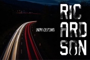
A Curated Gallery of Smashing Fonts for Creative Designers
38,691 Premium Fonts
Saturday, April 20
A Curated Gallery of Smashing Fonts for Creative Designers
38,691 Premium Fonts


 Designer: Mattia Bonanomi
'Odd or unnatural in shape, appearance, or character; fantastically ugly or absurd; bizarre.'
Following this definition, the design for Anti aims to create an un-compromised version of a grotesque sans-serif – where decorative details live in balance with brutalist shapes.
The result is an alphabet with a slightly modernist feeling and an eccentric touch, that work wonders at small sizes.
The typeface comes with four weights – light to bold – and features a character set supporting Central and Eastern European as well as Western European languages.
Font Family:
· Anti Thin
· Anti Light
· Anti Regular
· Anti Medium
· Anti Bold
Tags: book, clean, contemporary, display, fashion, grotesk, grotesque, legible, magazine, modern, sans-serif, text