Thursday, April 25
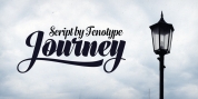
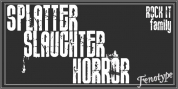
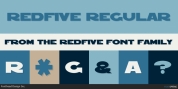
A Curated Gallery of Smashing Fonts for Creative Designers
38,691 Premium Fonts
Thursday, April 25
A Curated Gallery of Smashing Fonts for Creative Designers
38,691 Premium Fonts


 Designers: Alf Becker, Michael Adkins
Beginning in January, 1932, Alf R. Becker of St. Louis Missouri, at the request of then-editor E. Thomas Kelly, supplied SIGNS of the Times magazine's new Art and Design section with an alphabet a month, a project initially predicted to last only two years. Misjuding the popularity of the 'series,' it instead ran for 27 years, ending finally two months before Becker's death in 1959, for a grand total of 320 alphabets, a nearly perfect, uninterrupted run. In late 1941, just ten years after the first alphabet was published, 100 of those alphabets were compiled and published in bookform under the title, 100 Alphabets, by Alf R. Becker.
As published in October, 1937, this is the description that accompanied Becker's 70th alphabet, Modern Poster:
Advanced Modern Poster--Alphabet No. 70 in Alf R. Becker's series. When properly executed, this letter form gives a note of individuality to the modernly designed sign, display card or poster. The sketches of the 'B' and 'O' illustrate how the letters are constructed by combining elemntary strokes. The two letters were 1æ inches tall and were made with double strokes of a No. 8 red sable brush.
Many font designers have tackled converting Becker's incredible achievement from paper to digital, and many claim to treat his work with care and dignity. But the Fontry's Becker fonts remain the most historically accurate and viable treatments available, arriving in two industry-satisfying versions: CAS (Computer-Aided Signmaking) and DTP (Desktop Publishing). And as with all Fontry fonts, the kerning is not optional--it's exceptional-!!!
Font Family:
· ARB 70 Modern Poster OCT-37 DTP Normal
· ARB 70 Modern Poster OCT-37 DTP Normal Italic
· ARB 70 Modern Poster OCT-37 DTP Bold
· ARB 70 Modern Poster OCT-37 DTP Bold Italic
· ARB 70 Modern Poster OCT-37 CAS Normal
· ARB 70 Modern Poster OCT-37 CAS Normal Italic
· ARB 70 Modern Poster OCT-37 CAS Bold
· ARB 70 Modern Poster OCT-37 CAS Bold Italic
Tags: 1930's, vintage