Thursday, April 25
A Curated Gallery of Smashing Fonts for Creative Designers
38,691 Premium Fonts
Thursday, April 25
A Curated Gallery of Smashing Fonts for Creative Designers
38,691 Premium Fonts


 Publisher: Alan Meeks Collection
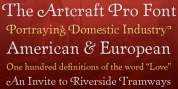
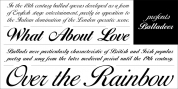
Based heavily on Gill especially in the mid weights, Astoria has a subtle top left serif which makes it not quite a Roman and not quite a Sans. Designed specificaly as a text face it still works very well as a headline font.
Astoria:
©2005 Designed by Alan Meeks for AlanMeeks.com
All Rights Reserved.