Wednesday, April 24
A Curated Gallery of Smashing Fonts for Creative Designers
38,691 Premium Fonts
Wednesday, April 24
A Curated Gallery of Smashing Fonts for Creative Designers
38,691 Premium Fonts


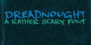
 Publisher: Three Islands Press
Flipping through a friend’s old hardbound collection of John Burroughs nature essays one day, I thought it’d be fun to see if I could create a typeface with the same uneven, imperfect look to it. I picked and chose among various printed characters, enlarged them somewhat with an old photocopier, scanned and hand-rendered each glyph—then topped things off with a couple goofy ornaments, just for the heck of it. What I ended up with was a surprisingly legible weathered serif akin to the Century faces. The full family has roman and true italic styles; OpenType features include true small capitals, old-style and lining figures, numerous ligatures, and Central/Eastern European alphabets.
Font Family: