Saturday, April 20
A Curated Gallery of Smashing Fonts for Creative Designers
38,691 Premium Fonts
Saturday, April 20
A Curated Gallery of Smashing Fonts for Creative Designers
38,691 Premium Fonts


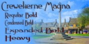
 Designers: Brian
J.
Bonislawsky,
Jim
Lyles
Designers: Brian
J.
Bonislawsky,
Jim
LylesAudiowide Pro has vague inspirations from other styles like that of Handel Gothic and the Converse logo, yet it veers off in a direction of its own for a slightly more techno-futuristic and yet cleanly readable format.
Great for both headlines and shorter body copy, its clean, legible forms lend itself to a plethora of uses. The SmallCaps and extensive figure sets offer Audiowide an even wider breadth of design options.
Font Family: Audiowide Pro Regular