Friday, April 26
A Curated Gallery of Smashing Fonts for Creative Designers
38,691 Premium Fonts
Friday, April 26
A Curated Gallery of Smashing Fonts for Creative Designers
38,691 Premium Fonts


 Publisher: HiH
One definition of "stop" as a noun is a point of punctuation. I have heard people from the British Isles speak of a "full stop" when referring to a period. Some may remember a 19th century form of communication called a telegram being read aloud in an old movie, with the use of the word "stop" to indicate the end of a sentence or fragment. A full dozen of these stop ornaments are provided. They occupy positions 060, 062, 094, 123, 125, 126, 135, 137, 167, 172, 177 & 190.
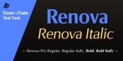
The Brass Family consists of two fonts: Brass and Brass Too. Both fonts have an identical upper case and ornaments, but paired with different lower cases. Although the typefaces from which the lower cases were drawn are both of modern design, both are interpretations of the textura style of blackletter in use in England when the upper case and ornaments were fashioned for the Abbey. Brass is paired with Morris Gothic, which matches the color of the upper case quite well. Brass Too is paired with Wedding Regular, which is distinctly lighter than the upper case. I find it very interesting how each connects differently. The resulting fonts are unusual and most useful for evoking an historic atmosphere.
Font Family:
· Brass
· Brass Too
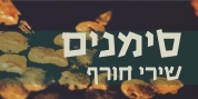
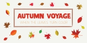
Tags: ancient, blackletter, conservative, decorative, english, garalde, revival, vintage