Friday, April 19
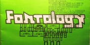
A Curated Gallery of Smashing Fonts for Creative Designers
38,691 Premium Fonts
Friday, April 19
A Curated Gallery of Smashing Fonts for Creative Designers
38,691 Premium Fonts


 Designer: Jamie Clarke
The font began as a handful of letters created for a logotype. It became clear that it would make an excellent display typeface, so it was expanded to include all uppercase letters, numbers, European accents and more. Warm and tactile, Brim produces punchy headlines and decorative titles. Perfect for posters, packaging and logotypes.
The name Brim accurately describes the expanded outer edge designed to produce its distinctive outlines. This overlapping structure couldn't function correctly in wood or metal type; however for digital typography this system produces a more efficient solution for colour type, both in design and smaller file size, important for web typography.
Many thanks to Dave Foster, Toshi Omagari, & Terrance Weinzierl, who generously gave their time to guide the design of this typeface.
For a flattened version, see Brim Combined.
Download the specimen for tips on using Brim Narrow.
Font Family:
· Brim Narrow Thin Lines
· Brim Narrow Fat Lines
· Brim Narrow Face
· Brim Narrow Outline
· Brim Narrow Half Extrude
· Brim Narrow Full Extrude
· Brim Narrow Half Extrude Outline
· Brim Narrow Full Extrude Outline
Tags: 3d, 1800s, advertising, antique, branding, capital sharp s, chromatic, contemporary, decorative, display, drop shadow, extrude, fun, headline, heavy, inline, layered, logo, luxury, outline, outlined, packaging, patterned, poster, retro, shadow, signage, striped, stripes, titles, versal eszett, victorian, vintage, wood type