Saturday, April 20
A Curated Gallery of Smashing Fonts for Creative Designers
38,691 Premium Fonts
Saturday, April 20
A Curated Gallery of Smashing Fonts for Creative Designers
38,691 Premium Fonts


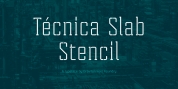
 Designer: Robbie de Villiers
Clareza is a solid Geometric workhorse ideal for clear, legible, applications including branding, advertising and signage. If you are looking for a font that is crisp with a little more personality, Clareza will absolutely fit the bill!
Font Family:
· Clareza
· Clareza Italic
Tags: advertising, billboards, branding, clarity, corporate identities, legible, packaging design