Thursday, April 18
A Curated Gallery of Smashing Fonts for Creative Designers
38,691 Premium Fonts


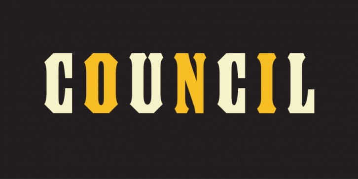
 Designed by John Downer, Council is a dingbat and wood type font family. This typeface has three styles and was published by Emigre.
Council was inspired by some capital letters, planographically printed, on a candy tin I bought at an antique store. The tin is the size and shape of a hat box, and it was made in the early 1900s for John G. Woodward & Co. of Council Bluffs, Iowa. The lettering is interesting to me both for its skillful design and because of its strong resemblance to wood type. The lettering is neither perfectly consistent nor slavishly executed, but it has the general look of being composed rather than drawn. Curiously, though, while this lettering style has many of the display attributes of wood type, it appears not to have been copied from any one known wood type font of its day. It is a meticulous synthesis of typographic and lithographic sensibilities. In my estimation, its dense, compact appearance seems to be the result of a commercial lettering artist’s unabashed admiration of xylographic poster types. I regard it as an example of mimicry in the best sense of the word.
My work on Council began in 1996 and concluded this year. I tried to develop the main font with as much fidelity to the proportions of the characters on the candy tin as was reasonable while adhering to certain established typeface production standards of today. (This font is kerned, for instance.) Of the full-size capitals in the face, only those I found in the name and location on the candy tin owe their shapes to one particular source. Thus, the A, B, C, D, F, G, H, I, J, L, N, O, R, S, U, W, and & all have models. I should mention that the D is unusual because it is the only letter with a convex side in my alphabet. This inconsistency exists in the original and is one I decided to preserve. The S, by comparison, had a squarish form I didn’t favor, so I deviated from it in my font. The balance of the upper case and small caps, plus the figures, punctuation, monetary symbols and miscellaneous reference signs represent my attempt to fill out the font.
The Word Logos were added later. There are no stacked letters to be seen on the candy tin, and just one raised letter, but given the narrowness of the characters in my font, I thought that short stacks or other arrangements of characters would be useful as a companion set. Zuzana Licko arranged them into two volumes.
-John Downer
Font Family:
