Saturday, April 20
A Curated Gallery of Smashing Fonts for Creative Designers
38,691 Premium Fonts


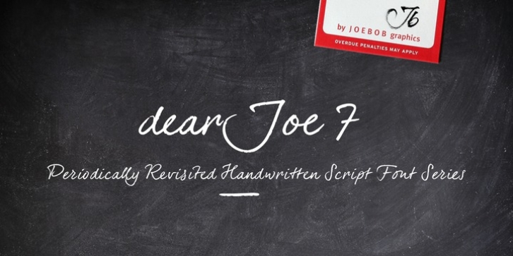
 dearJoe 7 was designed by Jeroen van der Ham and published by JOEBOB graphics. dearJoe 7 contains 1 style.
 Which they did: at this moment the dearJoe 1 font has been downloaded millions of times and can be found on Vietnamese riksjas, Tasmanian gyms and chocolate stores on 5th Avenue for instance.
The font is not something I am particularly proud of, but it started me of in building what's now the JOEBOB graphics foundry.
Inbetween creating other fonts, the dearJoe series has become a theme I revisit every once in a while, trying to create an update on how my handwriting has evolved, along with my abilities in creating fonts that mimic actual handwriting. In the last decade or so I started implementing ligatures and alternate characters, which helped a lot in coming to a result that can almost pass for actual handwriting.
The 2019 dearJoe 7 font is the latest addition to this font family.
All characters were scanned from handwritten notes, cherrypicking the characters and letter-combinations I liked best. They were written with a Lamy M66 B pen and only minor adjustments were made to the original scans, leaving most little flaws and rough edges as they were for a convincing ball-point on paper result.
The font comes with over 150 ligatures, making sure the font has a variated and credible overall look and feel.
Font Family: dearJoe 7
Tags: calligraphy, hand, handwriting, handwritten, ligatures, script
