Thursday, April 18
A Curated Gallery of Smashing Fonts for Creative Designers
38,691 Premium Fonts
Thursday, April 18
A Curated Gallery of Smashing Fonts for Creative Designers
38,691 Premium Fonts


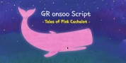
 Designer: Ray Larabie
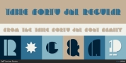
In years past, the square M N and W shapes were employed for stark, futuristic effect. These letterforms were at one time, considered a hindrance to readability. Today, generations of eyes have been acclimated to them from video games and low resolution displays; now they can blend smoothly into a paragraph.
The wide topped, lancet arched A, allows for less distortion in the heavier weights; the typical thinning and lowering of the crossbar trick isn't necessary, nor is the squaring and flattening of the point. The lancet arch correlates with the stroke of the R and requires less kerning that a triangular A.
Avoiding the flattened points was key to allowing a pointy Z, K and 7. All the sharp points have been slightly chamfered. The chamfers aren't meant to be noticed, they're meant to convey a little ruggedness. In consumer electronics, even sharp corners aren't really razor sharp when you get in close.
Font Family:
· Fluctuation ExtraLight
· Fluctuation ExtraLight Italic
· Fluctuation Light
· Fluctuation Light Italic
· Fluctuation Book
· Fluctuation Book Italic
· Fluctuation Regular
· Fluctuation Italic
· Fluctuation Bold
· Fluctuation Bold Italic
· Fluctuation ExtraBold
· Fluctuation ExtraBold Italic
Tags: contemporary, futuristic, legible, sans-serif, square