Thursday, April 25
A Curated Gallery of Smashing Fonts for Creative Designers
38,691 Premium Fonts
Thursday, April 25
A Curated Gallery of Smashing Fonts for Creative Designers
38,691 Premium Fonts


 Designers: Livius Dietzel, Tom Hoßfeld
In early 2018, Livius Dietzel & Tom Hoßfeld started developing the typeface's essential character and released a free font named after the studio, Lit. Just a few months later, Hannes von Döhren had a look at the typeface and suggested expanding it into a family – then publishing it with HvD Fonts. They drew every single letter from scratch, and also decided to give the font a new name - Graphit.
The family features six low-contrast weights, ranging from Black to Thin. Every character has been crafted to give it a distinctive and individual feel. Medium, Regular and Light are optimized for usage in copy text. For smaller font sizes & longer body copy, the alternate character set features a double-story a and a simplified Q, f, r and t for improved legibility. All fonts are manually hinted for optimal performance on digital devices.
Font Family:
· Graphit Thin
· Graphit Thin Italic
· Graphit Light
· Graphit Light Italic
· Graphit Regular
· Graphit Regular Italic
· Graphit Medium
· Graphit Medium Italic
· Graphit Bold
· Graphit Bold Italic
· Graphit Black
· Graphit Black Italic
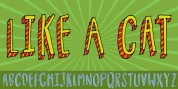
Tags: avant garde, bauhaus, bnf2019, book text, branding, circle, circle o, clean, commercial, contemporary, corporate, display, editorial, elegant, futura, geometric, german, headline, headlines, heavy, hinted, lineal, lit, logotype, low-contrast, magazines, modernism, rounded, sans, sans-serif, sharp, slab, square, swiss, technical, text, thin, triangle, vd2019