Wednesday, May 1
A Curated Gallery of Smashing Fonts for Creative Designers
38,691 Premium Fonts


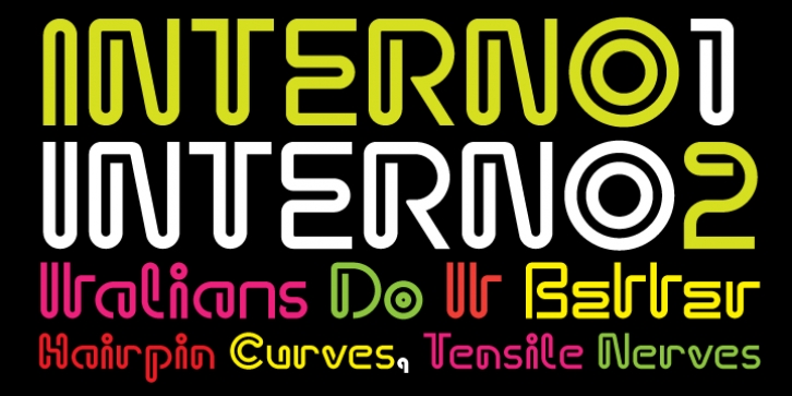
 Interno was designed by Ian Lynam, Eli Carrico and published by Wordshape. Interno contains 2 styles and family package options.
 Interno is Italian for internal (or at least that is what the translation widget told us). A great deal of the classic Olivetti design was down in-house (i.e. internal). Also, the typeface has internal switchbacks reminiscent of a paperclip. Interno sounds a bit like 'turning inside' phonetically(In-Turn-O). Additionally, Interno takes the first letter and last letter of Olivetti and flips it.
What was the inspiration for designing the font? It was built from a Walter Ballmer Olivetti logo exploration drawn sometime in 1960
What are its main characteristics and features? It is a highly contemporary display font that bends in on itself, evoking classic Italian modern graphic design.
Usage recommendations: Display type for use in editorial, packaging, and any other type of project that needs some Italian flavor.
Font Family:
· Interno 1
· Interno 2
Tags: 1960s, ballmer, bauhaus, brand new school, calarts, designers republic, display font, eli carrico, ian lyman, ian lynam, italian design, kada, line, monoline, monoline font, olivetti, tdr, walter ballmer
