Wednesday, April 24
A Curated Gallery of Smashing Fonts for Creative Designers
38,691 Premium Fonts


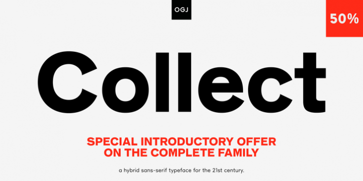
 JT Collect was designed by Oliver Jeschke and published by OGJ Type Design. JT Collect contains 3 styles and family package options. The font is currently #36 in Hot New Fonts.
 I developed JT Collect purely digitally, drawing from years of experience with analog type design. The letters aren't based on one particular source but seek to merge different type genres from the first half of the 20th century and lift them to a contemporary quality level. JT Collect is less reserved than strictly geometric designs and brings some industrial workmanship and honesty into the game.
One of the defining features of JT Collect are its figures: these go back to the great Swiss artist and designer, Max Bill (1908-1994), who studied at the Bauhaus and is regarded as one of the most important design teachers of the 20th century. The figures reference a typeface design of his that has been kept a secret for more than 50 years-until now.
The three weights of JT Collect offer what you need to make an impact. While cool and elegant in the Light weight, useful for both text sizes and display applications, the fonts show more presence on the page as they grow bolder. To this end, I drew the letterforms with a slightly unrefined, brawny air in the bolder weights. This sets them apart from the perceived purity of more geometric designs. The Book weight is ideal for short texts and medium-length copy, and the forceful Bold makes wordmarks look crisp and lets headlines radiate cosmopolitan self-confidence.
JT Collect is suitable as a primary typeface for branding, advertising, packaging, stationery, posters, documents, and websites from trades and industries as diverse as food & fashion, media & makers, culture & creators, games & gems, sports & startups. Use JT Collect for film titles or watch faces, for leaflets or store signs, for business cards or billboards: this font family is as adaptable as a chameleon (and like a chameleon, it's never boring). Try it in different contexts. You won't be disappointed.
Its adaptability also makes JT Collect a great starting point for poised and persuasive font combinations. Even a sans/sans pairing is possible due to hybrid nature of JT Collect-something that'd be hard to achieve with most other sans-serif typefaces on the market. You can add to it a heavy slab from the OGJ library, like Temper Wide. You might go for a geometric or a grotesque typeface as secondary (text) typeface. Or you could set your body copy in a classic serif typeface such as Caslon, Sabon, or Plantin. That's right: JT Collect is a true team player.
Whether you need a grotesque or a geometric sans: try JT Collect. You can get the best of both worlds.
Font Family:
· JT Collect Light
· JT Collect Book
· JT Collect Bold
Tags: advertising, body text, bold, branding, business, display, editorial, geometric, grotesk, grotesque, headline, jobbing type, packaging, sans serif
