Friday, April 19
A Curated Gallery of Smashing Fonts for Creative Designers
38,691 Premium Fonts


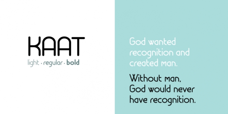
 Kaat was designed by Chris Nuijen and published by ChrisNuijen.com. Kaat contains 3 styles and family package options.
 Kaat is here to stay and to evolve. Everyone wants to try to be that little bit different, but essentially we are all the same, with the same inherent needs, just like babies or children. We need to be fed, watered, nurtured and loved, the only difference is in today's world you can do all that from behind a screen. 'Kaat' bridges that gap, transcending the basic needs of type, with the sophistication and fast paced sharpness of today, everyone wants to be different but we all stay the same, this is a reflection in the thickness and shape of each glyph.
The font represents how we are molded and cast differently in yet we still stay the same, because we need the repetition!
Everything needs to be done quicker, simpler and cheaper. We eat we sleep we communicate.
Font Family:
· Kaat Light
· Kaat
· Kaat Bold
Tags: grotesque, repetition, round, rounded, sans serif
