Thursday, April 25
A Curated Gallery of Smashing Fonts for Creative Designers
38,691 Premium Fonts
Thursday, April 25
A Curated Gallery of Smashing Fonts for Creative Designers
38,691 Premium Fonts


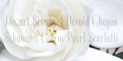
 Designer: Jan Fromm
Its compact spacing, low stroke contrast and heavy dots and accents give it an almost monolinear quality. The diagonals are slightly curved and the counters of the round letters such as b, o and q are generously wide. The muted, understated middle weights are built for extended body copy, while Komet's thin and dark weights look brisk and assertive and make for subtly expressive headlines.
Komet is an ideal choice for editorial design, branding and corporate design.
The Komet family comes in eight weights with matching italics, from Thin to Black. The glyph set of each font contains around 520 glyphs and provides good everyday support for most Latin-based languages. For a wider range of advanced OpenType features, Komet Pro is also available.
Font Family:
· Komet Thin
· Komet Thin Italic
· Komet ExtraLight
· Komet ExtraLight Italic
· Komet Light
· Komet Light Italic
· Komet Regular
· Komet Regular Italic
· Komet Medium
· Komet Medium Italic
· Komet Bold
· Komet Bold Italic
· Komet Heavy
· Komet Heavy Italic
· Komet Black
· Komet Black Italic
Tags: capital sharp s, clean, commercial, corporate, curved, display, headline, humanist, legible, logo, magazine, modern, packaging, printing, sans, sans-serif, signage, sturdy, text, versal eszett