Friday, April 19
A Curated Gallery of Smashing Fonts for Creative Designers
38,691 Premium Fonts
Friday, April 19
A Curated Gallery of Smashing Fonts for Creative Designers
38,691 Premium Fonts


 Designer: David Bergsland
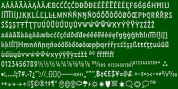
So they work very well for run-in heads, inline character styles, and all the rest of the needs in large books with complex formatting. They are designed for use in InDesign, and they work very well in that environment.
The fonts use the same OpenType feature files as the rest of the Librum families. The feature files for the italic and bold are more limited-as I have rarely used things like that [over the past 20+ years].
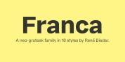
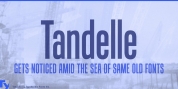
The character shapes are a bit whimsical. The original ancestor of this book design sans was a very playful font I released as Aerle. It's been calmed down a lot but is still loose and friendly.
For a great deal, see Librum Book Design Group, for a package containing all fifteen fonts!
Font Family:
· Librum Sans
· Librum Sans Italic
· Librum Sans Bold
· Librum Sans Bold Italic
Tags: book design, companion sans, display, elegant, humanist, legible, playful, sans serif