Tuesday, April 23
A Curated Gallery of Smashing Fonts for Creative Designers
38,691 Premium Fonts
Tuesday, April 23
A Curated Gallery of Smashing Fonts for Creative Designers
38,691 Premium Fonts


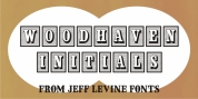
 Designer: Jeff Levine
While the lettering was quirky enough to warrant re-drawing as a digital font, the shapes would have presented a visual nightmare in design and spacing, so simple black rectangles were substituted and the letters appear in white.
Since novelty lettering of this type would never become 'standard' in use, its function became the font's name, Limited Appeal JNL.
There is just a simple A-Z and 1-0 character set along with basic punctuation.
Font Family: Limited Appeal JNL
Tags: 1950s, angular, bold, decorative, display, headline, irregular, novelty, quirky, retro, reverse lettering, sans serif, space age, unusual, white on black