Wednesday, April 24
A Curated Gallery of Smashing Fonts for Creative Designers
38,691 Premium Fonts
Wednesday, April 24
A Curated Gallery of Smashing Fonts for Creative Designers
38,691 Premium Fonts


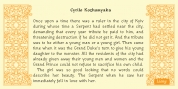
 Designer: Josep Patau
A solid construction, smooth, rounded, vibrant, generous curves and even more generous x-height and general proportions, give to the letter the vitality and freshness needed for use in projects where formality is not a requirement. Naughty but welldone, although not heeding the overshoots or the formal alignments, no symmetry in the horns is, despite this, or because of it, a fresh, cheerful but perfectly legible type.
A full menu of freshness in your tales and stories!
Font Family:
· Mario Light
· Mario Light Italic
· Mario Regular
· Mario Regular Italic
· Mario Demi Bold
· Mario Demi Bold Italic
· Mario Bold
· Mario Bold Italic
· Mario Heavy
· Mario Heavy Italic
Tags: arcade, branding, children, clean, funny, game, games, kids, logo, magazine, modern, party, play, playing, sans serif, signage