Thursday, April 18
A Curated Gallery of Smashing Fonts for Creative Designers
38,691 Premium Fonts


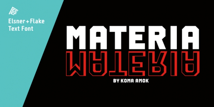
 Materia Pro was designed by Gerd Jakob, Joerg Meissner and published by Elsner+Flake. Materia Pro contains 8 styles and family package options.
 Following a minimalistic concept the font is formally built on a grid. Wherever optical curves are needed for a smoother, more comfortable shape of letters than a simple rectangular block, diagonals cut off the egdes – like a diamond is cut to achieve more beauty. Thus headlines and texts set in Materia are given a certain »egdy« feeling, whereas their tonality is still kept well-balanced, keeping concentation all on information in a nonconfomist way.
Materia comes in eight styles, from elegant Thin to attention-forcing Ultra. Even a regular Italic is available, following the classic type-set-principle. Two of the styles are explicitly designed for display use, Shadow and Code. Both are ready for combinations with Bold or each other respectively, the layering of Shadow and Code e. g. allows astonishing effects or highlighting within the letters.
For OpenType-users Materia is a real Pro, containing accented Latin letters for over 70 languages, small caps, old style, tabular and lining figures and special condensed titling all caps for cases in which space is all that counts. How useful all of the above mentioned is may be seen in the book David Lynch – Lithos, designed by Koma Amok, published in 2010 by item éditions, Paris, and Hatje Cantz, Germany, which was typeset completely in Materia.
Font Family:
· Materia Pro Thin
· Materia Pro Light
· Materia Pro Regular
· Materia Pro Italic
· Materia Pro Bold
· Materia Pro Ultra
· Materia Pro Code
· Materia Pro Shadow
Tags: 19th century, 20th century, block, contemporary, david lynch, diamond, edgy, france, futuristic, gaspipe, geometric, grid, industrial, lithos, minimalistic, nonconformist, postneutral, pure, rectangular, square, subtle, techno, well-balanced, wim
