Wednesday, April 24
A Curated Gallery of Smashing Fonts for Creative Designers
38,691 Premium Fonts
Wednesday, April 24
A Curated Gallery of Smashing Fonts for Creative Designers
38,691 Premium Fonts


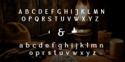
 Designers: Georg Trump, Patrick Griffin, Kevin King
The metal cuts of Mauritius seem to have been rushed in Weber's desperation to stay afloat. So the only impressions left of the metal type, the sole records remaining of this design, show substantial problems. Some can be attributed to technological limitations, but some issues in colour, precision and fitting are also quite apparent, particularly in Mauritius Kursiv, the italic metal cut.
This digital version is the result of obsessing over a great designer's final type design effort, and trying to understand the reasons behind its vanishing from typography's collective mind. While that understanding remains for the most part elusive, the creative and technical work done on these fonts produced very concrete results. All the apparent issues in the metal types were resolved, the design was expanded into a larger family of three weights and two widths, and plenty of 21st century bells and whistles were added.
For the full background story, design analysis, details, features, specimens and print tests, consult the PDF available in the Gallery section of this page.
Font Family:
· Mauritius
· Mauritius Italic
· Mauritius Medium
· Mauritius Medium Italic
· Mauritius Bold
· Mauritius Bold Italic
· Mauritius Condensed
· Mauritius Medium Condensed
· Mauritius Bold Condensed
Tags: academic, antique, baroque, book, book text, catalogue, classic, clean, composition, condensed, contemporary, crisp, editorial, elegant, family, fractions, georg trump, german, headline, humanist, legible, magazine, medieval, news, newspaper, news text, original, publishing, readable, roman, serif, sharp, small caps, smallcaps, text, titling, transitional, workhorse