Thursday, April 25
A Curated Gallery of Smashing Fonts for Creative Designers
38,691 Premium Fonts
Thursday, April 25
A Curated Gallery of Smashing Fonts for Creative Designers
38,691 Premium Fonts


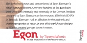
 Designer: Sergio Ramírez Llamas
A more fluid structure influenced by calligraphy is proposed for the italic variants, in this case the uppercase letters adopted a simplified semiserif structure that works better with the lowercase letters. Also the figures are very different from the roman version and follow more faithfully the italic style.
In an attempt to give Cyrillic lowercase romans a fresh look, symmetrical serifs inherited from the versal tendency are mostly avoided thus getting simpler structures closer to the latin forms.
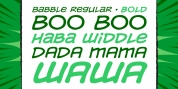
This type is good for commercial and editorial uses like advertising, packaging and pages with showy headlines where a warm touch wants to be given.
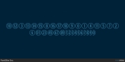
The character set includes a group of figures and currency symbols with standard height and another suited to match better with lowercase letters.
Mayonez was selected to be part of the Communication Arts Typography annual in 2015.
Font Family:
· Mayonez ExtraLight
· Mayonez ExtraLight Italic
· Mayonez Light
· Mayonez Light Italic
· Mayonez
· Mayonez Italic
· Mayonez SemiBold
· Mayonez SemiBold Italic
· Mayonez Bold
· Mayonez Bold Italic
· Mayonez Heavy
· Mayonez Heavy Italic
· Mayonez Black
· Mayonez Black Italic
Tags: 80's, advertising, american, ball terminals, beefy, black, bloated, blunt, book, bouncy, bowed, bulbous, candy, capital sharp s, comedy, commercial, conventional, cooper, corporate, cozy, cuddly, cupped, curvy, cyrillic, display, editorial, emotive, entertainment, fat, food, friendly, funny, gentle, grocery, happy, heading, headline, identity, kind, logo, magazine, mild, news, newspaper, nice, old-style numbers, packaging, plump, pop, poster, rational, retro, round, rounded, russian, serif, soft, stub serif, sturdy, sweet, titling, true italics, typewriter, ukrainian, versal eszett, versatile, warm, wood