Friday, April 26
A Curated Gallery of Smashing Fonts for Creative Designers
38,691 Premium Fonts


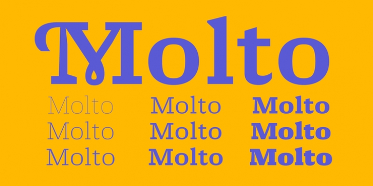
 Molto was designed by Xavier Dupré and published by TypeTogether. Molto contains 9 styles and family package options.
 Molto's nine weights are defined by their intended use. The two extreme weights (Hair and Fat) act as display partners for magazines, titles, and posters. The Hair weight is runway ready with its sturdy serifs, breathy internal space, and stable lettershapes that were designed both to perform and impress. Molto's Fat weight packs maximum punch in a believable way. Its wide and deliberate curves contrast against thin connections and landing strip stems. Molto can be put to perfect use in a fashion magazine using swashy Hair headlines set against its darkest weight.
Molto's seven intermediate weights, with their classic and legible shapes, are meant for texts of all sizes. The notches on diagonals, distinct numerals, and acute terminals grant benefits from caption sizes up to headings. Molto's refined light weights and punchy heavy weights set the stage for a swashy surprise - alternate capital letters act as refined garments laid atop its concrete skeleton.
The Molto font family rejects saving space in favour of intensifying shapes, placing maximum weight on the edges for better legibility and impact. Latin-based digital and printed designs will benefit from Molto's design voice and breadth. This means UI, video, and online text, and print materials like dictionaries, packaging, advertising, and branding can all put Molto's robust forms to multipurpose use. Molto successfully creates balance in a slab serif design: an opinionated and striking type family, stalwart in captions and exuberant in display, thanks to swashes which add some originality to the slab category.
Font Family:
· Molto Hairline
· Molto Thin
· Molto ExtraLight
· Molto Light
· Molto Regular
· Molto Medium
· Molto Bold
· Molto Black
· Molto Fat
Tags: baroque, bold, book, concrete, constructed, contrast, decorative, display, editorial, elegant, flourish, headlines, humanist, informal, legible, ligatures, magazine, old-style, ornaments, playful, serif, slab, smallcaps, striking, sturdy, swash, swing, symbols, text, vibrant
