Tuesday, April 23
A Curated Gallery of Smashing Fonts for Creative Designers
38,691 Premium Fonts
Tuesday, April 23
A Curated Gallery of Smashing Fonts for Creative Designers
38,691 Premium Fonts


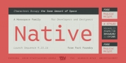
 Designer: Mattox Shuler
With those things in mind, the goal for Native was to strike a balance between personality and usability. Native's charm can come out in the tail of the "a" or the flow the italic "r," but it still retains readability without its quirks becoming overbearing. Native's counters were kept open in order to aid legibility at smaller sizes, and the italics were given their fair share of differentiation to bring emphasis for items such as a comment in a line of code.
Native's weights and italics all occupy the same amount of horizontal space so no alignment issues will occur when switching between styles. To top it all off, the Regular weight is free of charge for all types of licenses. Enjoy.
Font Family:
· Native Light
· Native Light Italic
· Native
· Native Italic
· Native Bold
· Native Bold Italic
Tags: branding, clean, code, computer, contemporary, digital, fixed-width, grotesque, humanist, info, mono, monospace, sans, sans serif, tabular, typewriter