Friday, April 26
A Curated Gallery of Smashing Fonts for Creative Designers
38,691 Premium Fonts
Friday, April 26
A Curated Gallery of Smashing Fonts for Creative Designers
38,691 Premium Fonts


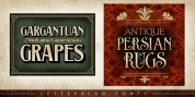
 Designer: Natanael Gama
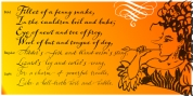
Nazaré fits in a semi-serif category and it has a large contrast. It works outstandingly in display use specially in the bolder weights that have even more contrast. The regular weights have a more moderate contrast and an overall less extravagant design, fitting best in the typographical conventions. this provides a better render in text use.
You can use this font in large headlines, logos, posters, book covers, and general display use as well as short strings of text.
Nazaré is the name of a small Portuguese fishing village known for its giant waves and peculiar people.
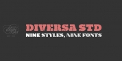
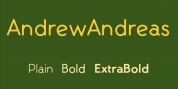
Font Family:
· Nazare Regular
· Nazare Medium
· Nazare Semi Bold
· Nazare Bold
· Nazare Extra Bold
· Nazare Heavy
Tags: 20s, 30s, 40s, 50s, bold, decorative, display, extravagant, headline, heavy, high contrast, poster, retro, semi-serif, semi sans, semi serif, vintage