Thursday, April 25
A Curated Gallery of Smashing Fonts for Creative Designers
38,691 Premium Fonts


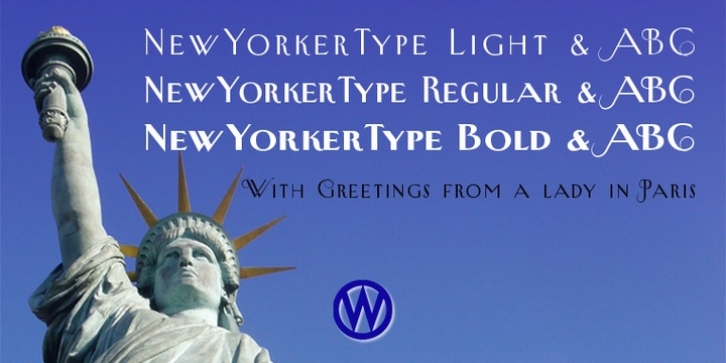
 New Yorker Plus was designed by Gert Wiescher and published by Wiescher Design. New Yorker Plus contains 6 styles and family package options.
 I meant it as a revival of the typeface used by the New Yorker magazine. I did not scan it in, I just looked at the type and redrew it completely by hand. So it is not just a copy, but rather a redesign. Only much later did I come to know, that there is a bundle of similar typefaces of that period. Rea Irvin's design for New-Yorker magazine was just one of them, but the best.
Lately I looked at the fonts and found, that they should be worked over, what I did. I added a Swashes set for each weight and generally cleaned up the design. Plus I made the complete Latin set, so that all European countries can use it. (Except for the Greeks and Russians, sorry!)
Yours, sincerely once more honoring Rea Irvin, a great type- and magazine-designer.
Gert Wiescher
Font Family:
· New Yorker Plus Light
· New Yorker Plus Swash Light
· New Yorker Plus
· New Yorker Plus Swash Regular
· New Yorker Plus Bold
· New Yorker Plus Swash Bold
