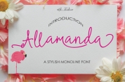
Saturday, April 20
A Curated Gallery of Smashing Fonts for Creative Designers
38,691 Premium Fonts
Saturday, April 20
A Curated Gallery of Smashing Fonts for Creative Designers
38,691 Premium Fonts


 Publisher: Hubert Jocham Type
In 1999 Libris was chosen as the corporate typeface of Bally Switzerland. I also was involved in the design of the entire branding.
NewLibris is the version that was published in my own shop.
- What was the inspiration for designing the font? NewLibris is an elegant contemporary easy to read sans serif. It has a wide variety of weights and proportions that are easy to use in corporate branding and magazines.
- What are its main characteristics and features? contemporary humanist legible sans serif
- Usage recommendations: corporate branding and magazines and other publications
Font Family:
· NewLibris Thin
· NewLibris Thin Italic
· NewLibris Fine
· NewLibris Fine Italic
· NewLibris Light
· NewLibris Light Italic
· NewLibris Book
· NewLibris Book Italic
· NewLibris
· NewLibris Italic
· NewLibris Medium
· NewLibris Medium Italic
· NewLibris SemiBold
· NewLibris SemiBold Italic
· NewLibris Bold
· NewLibris Bold Italic
· NewLibris Heavy
· NewLibris Heavy Italic
· NewLibris ExtraBold
· NewLibris ExtraBold Italic
· NewLibris UltraBold
· NewLibris UltraBold Italic
Tags: clear, contemporary, corporate, editorial, elegant, fashion, frank magazine, german, humanist, legible, magazine, natural, organic, sans-serif, sans serif, text, true italics, workhorse