Wednesday, April 24
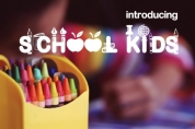
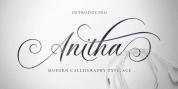
A Curated Gallery of Smashing Fonts for Creative Designers
38,691 Premium Fonts
Wednesday, April 24
A Curated Gallery of Smashing Fonts for Creative Designers
38,691 Premium Fonts


 Publisher: HiH
Although about 14 miles inland, Norwich, Connecticut lies at the head of the Thames River. The river is both wide and deep, and therefore was not bridged in the early 20th century. Until then, if you wanted to get from Groton on the west bank to the whaling port of New London on the east bank by land, you had to go by way of Norwich.
Because of its size, the Thames is navigable all the way from Norwich to New London. Docks were built in Norwich around 1685 and the city became Connecticut's 2nd largest port by 1800. With the construction of the Norwich & Worcester Railroad in 1835, Page could easily ship his wood type north by rail or south by coastal schooner. Included with our font, Norwich Aldine ML, are two 19th century printer's ornaments of sailing ships similar to those that sailed up the Thames to Norwich. Reference: Moon's Handbooks, Connecticut 2nd Edition (Emeryville CA 2004)
The family has expanded from one to four fonts:
1. Norwich Aldine ML: the concept font, computer-sharp corners and smooth curves, as we imagine it was designed. 336 Glyphs including some reduced-width alternatives for better letter spacing.
2. Norwich Aldine Worn ML: the way actual wooden type would look after have been used for a while. 332 Glyphs
3. Norwich Aldine Distressed ML: the way the wooden type would look after it had really been used, perhaps abused. Alternatives to the more popular letters reflect the damage that typically occurs on a well-wormn font, with nicks, cuts and scratches and the overall wear that reduces the overall height and leads to uneven inking due to varying heights in the chase. A couple of bullets look like bullet holes. 345 glyphs.
4. Norwich Aldine Cyrillic: Cyrillic includes alll English and Cyrillic letters for MS Windows Code Page 1251, ISO 8859-5 and MacOS Cyrillic. 235 glyphs. We did Cyrillic because is was fun and we felt the basic design cried out for Cyrillic. While obviously subjective, we hope you will agree.
Font Family:
· Norwich Aldine
· Norwich Aldine Worn
· Norwich Aldine Distressed
· Norwich Cyrillic
Tags: 1900s, allcaps, bold, decorative, display, headline, retro, reverse contrast, serif, slab serif, strong, vintage, western, wood type