Friday, April 19
A Curated Gallery of Smashing Fonts for Creative Designers
38,691 Premium Fonts
Friday, April 19
A Curated Gallery of Smashing Fonts for Creative Designers
38,691 Premium Fonts


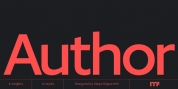
 Designer: Marconi Lima
Obvia appeared as a result of direct observation on typefaces classified as geometric and the plan to explore for the first time width axes - to be published soon - expanding its usability.
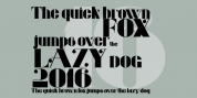
The idea behind Obvia's design was to create a distancing from geometrically pure shapes, in this case, square shapes. Then some details were added, such as subtle inktraps, concave endings of the stems and carefully drawn alternate characters, giving a 'geohumanist' tone to the font.
This first family of Obvia has 9 weights ranging from Thin to Black with their respective italics, delivering a strong typographic identity, from the paper to the pixel.
Font Family:
· Obvia Thin
· Obvia Thin Italic
· Obvia Extra Light
· Obvia Extra Light Italic
· Obvia Light
· Obvia Light Italic
· Obvia Book
· Obvia Book Italic
· Obvia
· Obvia Italic
· Obvia Medium
· Obvia Medium Italic
· Obvia Semi Bold
· Obvia Semi Bold Italic
· Obvia Bold
· Obvia Bold Italic
· Obvia Black
· Obvia Black Italic
Tags: alternates, app, books, branding, broadcast, clear, contemporary, currencies, desktop, devices, display, ebooks, editorial, flexible, geometric, headline, humanist, languages, legible, ligatures, magazines, modernist, natural, neutral, newspapers, numerals, obvia, opentype, organic, packaging, prints, rational, sanserif, screen, screens, sign, sites, smartphone, sober, squared, symbols, text, variable, webfonts