Thursday, April 25
A Curated Gallery of Smashing Fonts for Creative Designers
38,691 Premium Fonts


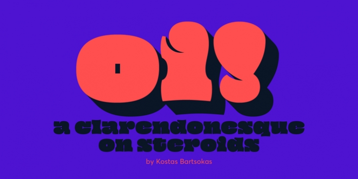
 Oi! was designed by Kostas Bartsokas and published by Intelligent Design. Oi! contains 2 styles and family package options.
 Its letters occupy as much space as possible, bulging sometimes dangerously close to explosion. Ascenders and descenders are minute compared to the ridiculously tall x-height, and the bracketed serifs just a memory of themselves. Closed counters become plain rectangles, open counters tend to transform to thin lines, the occasional ball terminals nod playfully to their ancestors, while accents and diacritics squeeze themselves onto the letters, merging into unique new shapes.
Oi! supports Latin and Greek and comes in two styles. Oi! You!, the regular style, and its accompanying Oi! Mate!, a shadowed style that adds a third dimension to its playfulness.
Font Family:
· Oi! You!
· Oi! Mate!
Tags: black, clarendon, display, fat, shout, slab, slab-serif, ultra
